The homepage of an online store is not only a connection to the rest of the website, but it also represents the full essence of your business. A thoughtfully designed Ecommerce Homepage Design may increase trust, most transparently explain what you are selling, and guide visitors to the important actions like purchasing, subscribing, or exploring products.
Customers decide on the appearance of your website within milliseconds. At this very moment, people determine whether your store appears trustworthy and enticing enough for them to stay, or if they should move on and seek help elsewhere.
If your Ecommerce homepage design implements the Correct Design Practices, It May Attract The Users, Help You Retain The Visitors, and the Visitors Might Become Your Customers.
On the other hand, a badly arranged homepage can very quickly repel visitors, especially if the visitors are unable to access the vital information or grasp what your firm is all about.
In order to help you in designing the greatest homepage that will work at its best, we have compiled a collection of amazing Ecommerce design examples that we have collected throughout the internet. Through these examples, you will see effective design features that not only boost the site's usability but also reinforce the branding and increase conversions.
Besides listing products, a successful Ecommerce site should attract and keep visitors. Your store's home page is the first impression of your business, and you can lose buyers if it's not appealing.
You need to be careful with bounce rate, which measures the proportion of users leaving a website after seen home page. On average, a typical online business has a bounce rate of 45-46%, implying that approximately 50% of your new consumers may quit without looking at your offers.
Reducing the bounce rate can have a major impact on sales. If you keep the visitors with outstanding navigation, beautiful images, and convincing calls to action, you are more likely to turn them into regular clients.
Each ecommerce brand is distinct. The Ecommerce Homepage Design and SEO should be inspired by your audience, product line, and brand character. Since not all techniques suit every store, concentrate on those that align with your objectives and clients.
Here are some essential aspects that any successful eCommerce website should have:
Combining these ideas with an accurate knowledge of your target market can transform your Ecommerce homepage into a very powerful tool for both user engagement and the boosting of sales.
When individuals visit a new internet store, caution is normal. They want to know their personal and payment information is safe and that they won’t be left empty-handed after making a transaction.
Your Ecommerce Homepage Design should instantly communicate credibility and reassure visitors that your firm is credible. Here are some successful strategies to create trust:
When you physically convey trust on your site, you can give the visitors confidence while surfing, and as a result, you will most probably achieve higher conversion rates.
First, great online brands use vibrant colors, minimalist frameworks, and state-of-the-art aspects to capture attention right away. A visually appealing homepage reduces bounce rates, encourages additional visits, and helps decision-making.
Regardless of their brilliance, the most effective Ecommerce homepages share one trait: they are basic, easy to use, and understandable. Dazzling images should enhance, not confuse, the user experience.
Look no further than our collection of Ecommerce homepage design ideas from some of the world's most successful online stores. We bet you'll see a pattern there: simple, clean, and user-friendly designs that keep people coming back.
Countless Ecommerce sites continue to focus on desktop user experience while ignoring the critical reality that nearly 70% of all internet browsing is done on mobile devices. This transition implies that businesses that are not optimized for mobile are losing nearly all of their potential clients daily.
A genuinely good Ecommerce homepage design should outperform differentiating devices only in terms of appearance. Your mobile site must be as beautiful, quick to load, and user-friendly as your desktop version. Allowing people to shop simply from their phones removes conversion barriers, resulting in sales that would otherwise go unnoticed.
Key mobile optimization tips:
When you prioritize mobile users, you're catering to the majority of online customers nowadays.
A complex navigation system is one of the main reasons why people leave a website quickly. If users are unable to navigate or find what they are looking for in a matter of seconds, they will certainly look for alternative solutions.
Your Ecommerce homepage design's navigation should be clear as a roadmap. Don't overwhelm visitors with too many menu options or use unclear category titles. Instead, create a menu that is simple to understand with clear labeling and appropriate categorization.
Best practices for easy navigation:
If navigating the site is quick and easy, visitors will stay longer, check out more products, and be much more likely to buy.
Now that we've covered the theory, let's see how these principles work in practice.
A solid value proposition is essential for every Ecommerce website that wishes to attract more clients than its competitors. In other words, visitors should first learn about what you're selling.
Why it matters:
A good tagline or headline on your homepage should convey your main value in a single, clear sentence. Ensure it is in a very noticeable position so visitors who come for the first time can immediately figure out at a glance what makes your store different from the others.
Example:
Blue Nile is a good example of a straightforward line that tells customers the kind of value they will get: a selection of fine jewelry, transparent pricing, and service by experts.
It is easier for potential customers to stick around and become buyers once your value proposition is crystal clear.
Among the most dependable Ecommerce UX best practices is to make product categories easy to identify and explore. Your category menu is effectively a table of contents for your store; it should take users effortlessly to what they are looking for. Your Ecommerce Homepage Design is at its finest when categories are natural.
Best practices for category navigation:
Example:
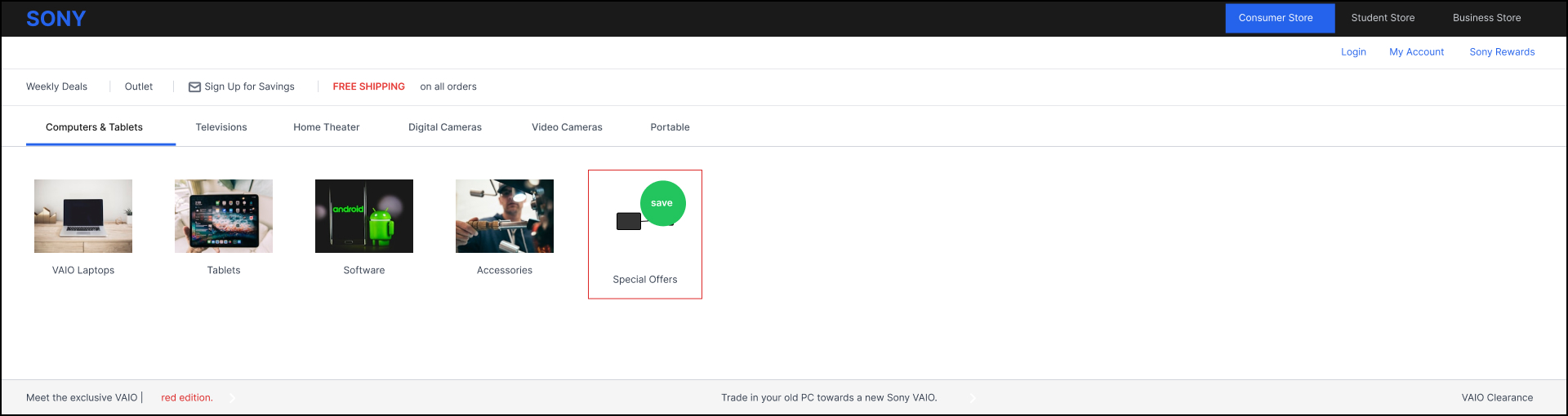
Sony's navigation system is pretty straightforward, and users can simply find the items and promotions without any issue.
Dropdown menu tips:
Consumers greatly increase their purchases when they are oriented faster through the good organization of categories and the easy browsing of these.
Your homepage should highlight the complete range of things you have in store, not just your bestsellers. Research suggests that 28% of large US Ecommerce websites only exhibit a limited part of their inventory on the homepage; consequently, they lose the possibility to pull in varied customer interests.
Why product diversity counts in Ecommerce Homepage Design:
Although it is quite enticing to concentrate just on best sellers or the most profitable things, a balanced homepage that is supplied with numerous product categories makes the browsing experience much better.
Example:
Charlotte Russe successfully showcases a variety of products, showcasing activewear and footwear alongside gowns, therefore providing its visitors with a very clear picture of the complete catalog just from the homepage.
Right away, the visitors recognizing value will be more ready to walk through and locate products they weren't initially shopping for.
Price has always been a crucial aspect when it comes to making a purchasing decision, and the same goes for internet buying. According to a study, more than 70% of internet users in the United States believe that a discount offer plays a vital role in their purchasing decision, especially during the holiday season.
Why featuring deals matters in Ecommerce Homepage Design:
Always ensure that your special deals are presented in the most prime areas on the homepage, i.e., above the fold, or in specially designed, visually enticing sections.
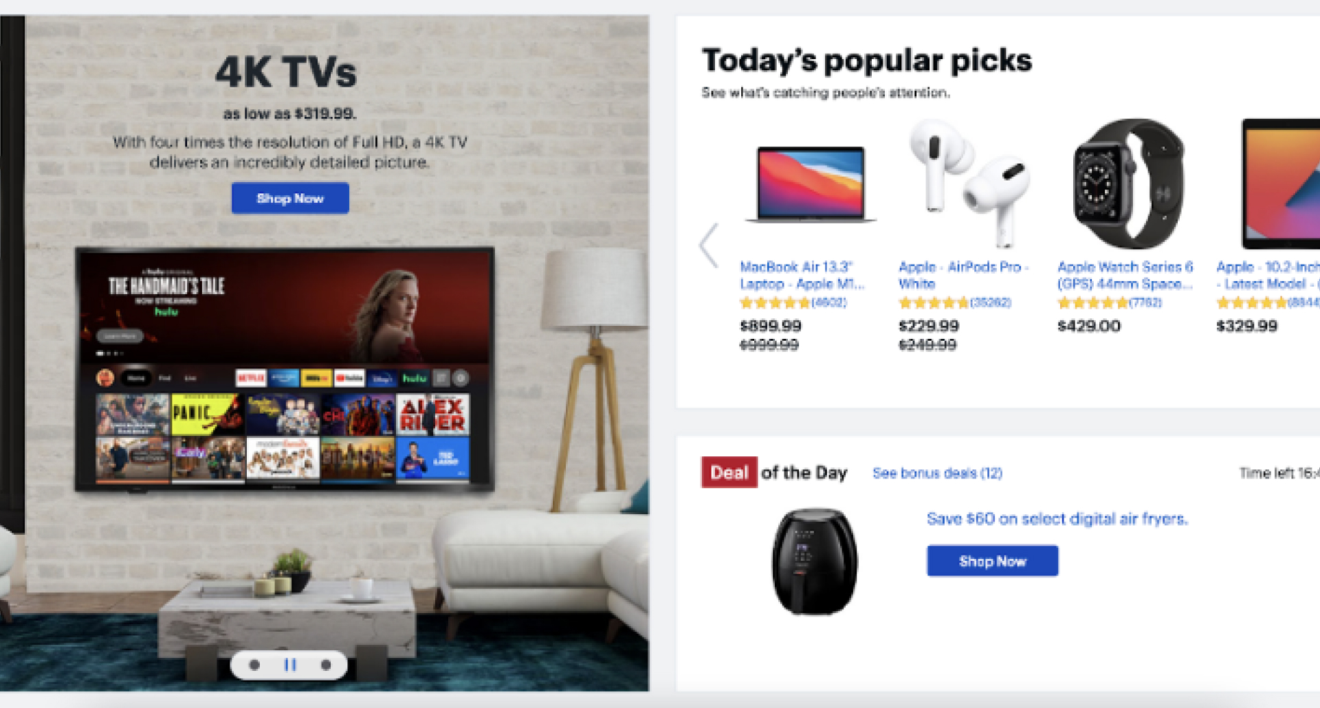
Example:
On its homepage, Best Buy clearly shows the "Deal of the Day" area; it is quite easy for visitors to find the daily bargains, and the company is also pressuring customers to decide swiftly.
Bonus tip: Use pop-ups for extra visibility
Pop-ups are incredibly successful at attracting people's gaze, even more than a static site part. By using them, you can be sure that visitors won't neglect your promos.
Example:
NativeCos contains popups to emphasize contests and time, restricted deals; hence, they get users hooked at once, right when the site goes up.
When retailers' offers are made the most evident, consumers receive the idea that they are actually getting something worthwhile, which improves the possibilities of them going through with a purchase.
Displaying the greatest sellers allows buyers to rapidly locate the things that others have loved and trusted. When shoppers notice what's trendy or highly rated, it relieves the mental strain of selecting and assures their judgment.
Showcasing popular things easily and logically is one of the outstanding advantages of Ecommerce Homepage Design:
Example:
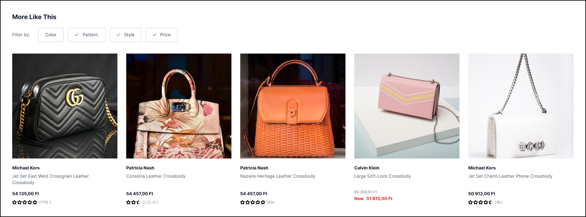
Macy's displays a "More Like This" space beneath photographs of their top-selling bags, thereby easing client access to the highly reviewed selections.
Bonus strategy: Use pop-ups
Pop-ups can promote popular products with remarks such as "Have a look at our most loved items before going"; this is excellent for capturing the attention of visitors who are about to leave.
On viewing what is currently popular, shoppers become more sure about their purchases and are less tempted to leave without buying.
Personalization makes clients feel that their wants are well understood, and at the same time, it helps them to find products that are tailored to their interests. Employing intelligent technology to give clients customized suggestions is certain to enhance the level of their engagement and the number of purchases.
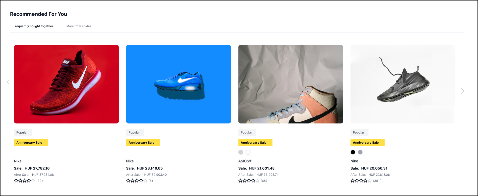
Ecommerce Homepage Design thrives with personalization that works like this:
Nowadays, online purchase recommendation algorithms track visitors' activity and subsequently make suggestions on the basis of user behavior.
Why does it enhance conversions?
Example:
The retailer employs a "Recommended for You" feature that presents individualized product suggestions, making the experience of every visitor different and unique.
Customers are significantly more motivated to include products in their shopping carts and finish a purchase when they come across items suiting their tastes and requirements.
The "page fold" is the word for the section of the page that visitors see before they start scrolling. It is a really significant region since 80% of users spend their attention on it, and a lot of them make the decision to stay or go depending on what they see at first.
Why it matters:
Put your hero products, greatest sellers, or major offerings in this excellent location to draw attention straight away.
Example:
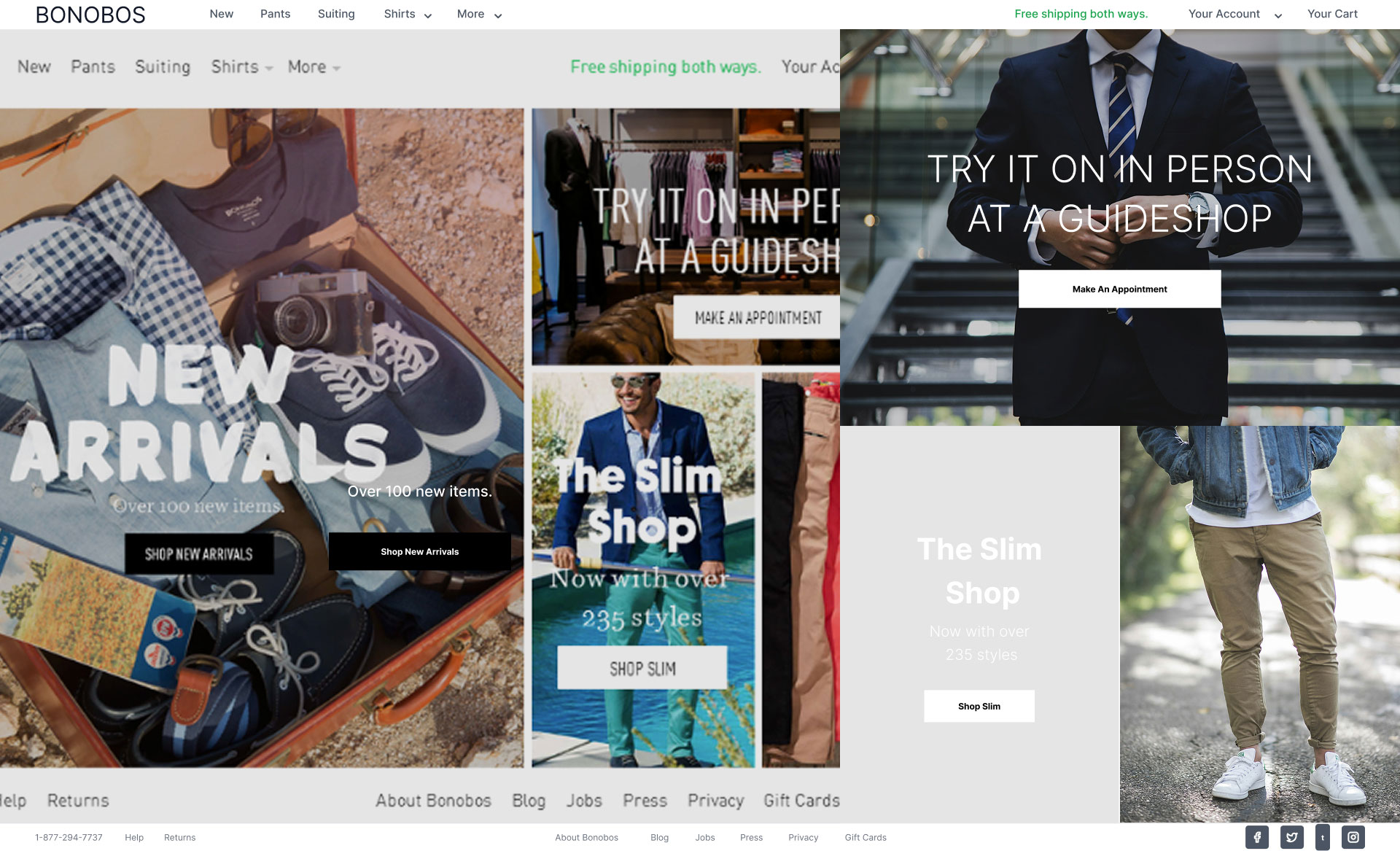
Bonobos displays the products that exhibit its brand identity immediately above the fold, so that visitors can instantly see what it is offering.
If your top products are displayed without scrolling, you are likely to have more engagement, and fewer people will abandon your site.
Shipping prices and return policies are one of the primary elements that affect whether a client will make a purchase or not. If your organization gives free delivery or easy returns, don't forget to publish this information right away on your main page so that people can see it.
Why it boosts conversions in Ecommerce Homepage Design:
Where to place it:
Put the shipping and return information at the very top of your homepage, adjacent to your logo or in the header area, so that customers can see it immediately.
Example:
Frederick's of Hollywood places their shipping statement right next to their logo at the top of the page, making sure it's one of the first things shoppers notice.
Shoppers will be more confident in finishing their purchases if the policies are transparent and favorable to the buyer.
Dynamic banners and carousels allow you the opportunity to present a variety of products, categories, or specials in one major area. If you have a big range of products and want to demonstrate variety on the initial screen, this is an efficient solution.
Why carousels work:
Example:
Sugar Cosmetics carousel their five banners showing the top specials to keep their homepage fresh and entertaining for recurring visitors.
Best practices for carousels:
When done well, carousels highlight your best content while keeping your site clean and organized.
Social media plays a key role in building trust and expanding your reach. Actually, 39% of online marketers think that social sharing has a direct impact on the increase of conversions.
Why social icons matter in Ecommerce Homepage Design:
How to use them effectively:
Place social media icons prominently on your homepage, usually in the header or footer. Make them easy to find so visitors can follow you or share products they love.
Encourage sharing:
Make it easy for your clients to share by adding simple calls to action such as 'Share this product' or 'Follow us for the special deals'.
If more people see that your brand is trusted and liked by others, they will likewise be more inclined to trust you, and trust leads to conversion.
Give your visitors a reason to share your items and website with the reward of discounts, store credit, or unique advantages. They will be more inclined to share if you give them something that helps them. Customers who are compensated for sharing their experience with your brand might change into brand ambassadors and help you reach new audiences organically.
Why it works in Ecommerce Homepage Design:
Example:
Jimmy Jazz gives a $10 reward to shoppers who invite their friends via social media. The company advertises it straightforwardly on their main page by way of a floating bar on the right side that catches attention without being invasive.
Clicking on it basically activates a pop-up with crisp information about the workings of the referral program and the kinds of incentives that clients are able to acquire.
Best practices:
Incentivized sharing is a terrific technique to build word, of, mouth marketing while at the same time, rewarding your loyal customers.
Up to 79% of site visitors merely scan the pages instead of reading every word. This means that your photographs should carry most of the burden in terms of establishing a compelling initial impression.
Reasons for Image Quality Importance in Ecommerce Homepage Design:
Industries where this is critical:
It is critically crucial for the fashion, home furnishings, and outdoor items industries to have high-quality photos, as these are the categories where shoppers visually assess things for style, texture, and quality.
Best practices:
When your photographs are nice and professional, people will trust the quality of your products and purchase more.
Different visitors have different needs; new customers require familiarization with your brand, whereas returning visitors look forward to a personalized experience. Customizing your homepage according to visitor type is a great way to increase user engagement and sales.
For returning customers in Ecommerce Homepage Design, show:
For new visitors, focus on:
Example:
Coastal.com greets first-time consumers with a landing page that not only introduces its brand but also offers a first-time discount, creating a strong first impression.
By treating new and returning visitors differently, you may make the experience more relevant and engaging for both.
At the heart of a successful Ecommerce Homepage Design is simplicity. In fact, up to 84.6% of designers consider that a cluttered website is one of the most serious mistakes a firm can make.
Why simplicity wins:
What to avoid:
Best practice:
Continuously evaluate your landing page and remove anything that does not have a clear value. Every component should encourage visitors to make a purchase.
Example:
Warby Parker is one of the cleanest Ecommerce layouts, with only a few proper features that are so effectively integrated that they create a smooth and enjoyable purchasing experience.
A straightforward, focused design enables clients to purchase without confusion or aggravation.
Nowadays, the majority of internet buyers view and purchase only through mobile devices. As a result, your EcommerceEcommerce Homepage Design should prioritize mobile users over other visitors.
Why mobile-first design matters:
Key mobile design elements:
Special focus on CTAs:
Call, to, action buttons are instrumental in directing users through your sales funnel. On a mobile device, they must be big, noticeable, and easy to tap.
In 2026, websites that neglect mobile optimization will see their customers going to those competitors who provide them with a seamless mobile experience.
When it comes to building an efficient Ecommerce Homepage Design, it's more about combining stunning design with user-friendly features than it is about using secret tactics. Essentially, the goal is to create a site that clearly exposes your products and simplifies the purchase experience.
To achieve this, focus on:
The examples we've looked at showcase how successful brands creatively apply these ideas. They should motivate you to improve your site, use what works for your audience, and remain consistent with your company identity.
In 2026, your Ecommerce homepage may be a powerful tool for attracting visitors as well as increasing sales by properly combining design, functionality, and customer attention.
CEO & Founder of DecodeUp, a tech agency helping brands scale in eCommerce and Fintech. With 12+ years of experience, he blends technical expertise with business insight to build user-focused platforms that drive growth, engagement, and lasting impact.


stay in the loop